


Make It Real! Online
The digital practice component accompanying printed learning materials becomes established.

 mironlineCASE STUDY · EDTECH · 2021—2023
mironline combines General and Professional English practice with academic follow-up for higher-education students and teachers in Latin America. From 2021 to 2023 I took part in its modernization as a UI/UX Designer + Frontend developer.
ROLE
UI/UX Designer + Frontend
PERIOD
Oct 2021 — Oct 2023
PRODUCT
English learning platform
STACK
Figma · HTML · CSS · JavaScript · Bootstrap · jQuery · GitLab · Google Analytics
mironline is an online English-practice platform for higher-education students and teachers in Latin America. It evolved from Make It Real! Online, the digital component that complemented a book series with additional practice.
Origin and evolution
The digital practice component accompanying printed learning materials becomes established.
The product is restructured for higher education and Latin American contexts.
The LMS is developed and practice expands through General English and Professional English.
The period documented in this case: web migration, responsive behavior, interaction system, validation and iteration.
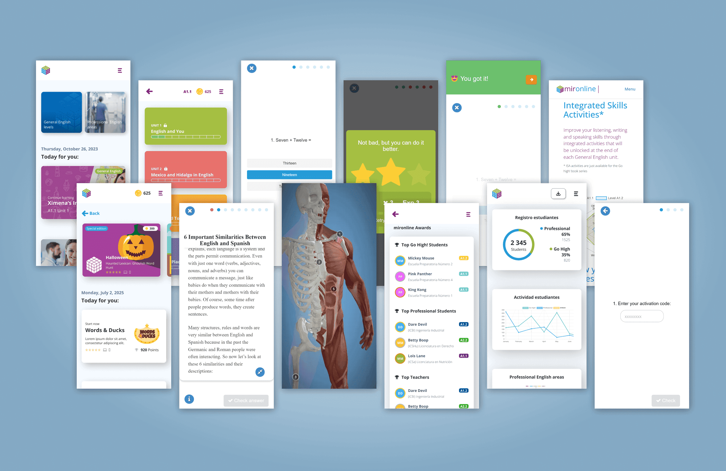
The product grew to include General English and Professional English: grammar, vocabulary, reading and writing activities, progress tracking, and specialized content by professional field. It also incorporated audio, video, 3D models and 360° experiences.
Books provided part of the academic sequence; mironline extended that practice digitally and connected student activity with the information teachers needed for follow-up.
BOOKS
Content + sequence
GENERAL ENGLISH
Language practice
PROFESSIONAL ENGLISH
6 professional fields
FOLLOW-UP
Progress + performance
The experience connected two needs: practicing and moving through a course, and following academic progress. The profile boards summarize each user's context; here I highlight only what shaped the interface.
Primary user
Uses mironline to practice and complete activities across different devices.
Follow-up user
Uses the platform to review group progress and identify where follow-up is needed.
How information was organized
mironline connected student practice with the information teachers needed for academic follow-up.
Student main flow
Teacher main flow
How they connect
Student activity, answers and progress are organized by the platform so teachers can review performance and follow up on the course.
These profiles condense real usage patterns observed among students and teachers throughout the project.
The academic content was still useful, but an important part of the experience depended on technology that was getting in the way of using it normally.
By 2021, mironline already had years of published courses and activities. Part of that content depended on Flash*, a technology widely used to run multimedia and interactive experiences inside the browser.
Once browsers stopped supporting it, the problem became visible to users: blank screens, activities that would not open on mobile, compatibility warnings or players that took too long to load.
Modernization was not about copying every old screen into HTML. Each activity still had to preserve what it was meant to teach or assess while being rebuilt for responsive web and current browsers.
*Adobe ended support for Flash Player in 2020 and blocked Flash content from running in 2021. The platform needed to replace that dependency with current web technologies.
What the solution had to preserve
The learning goal of each activity.
Use across desktop, tablet and mobile.
Compatibility across browsers and devices.
Shared rules across different exercises.
mironline was not simply a collection of exercises. Interface decisions had to coexist with a pedagogical model, different English levels, and concrete student and teacher needs.
Project material connected situational analysis, student needs, classroom English, teaching cycles and learner autonomy. That structure helped explain why an interaction could not be designed around appearance alone.
For the product, this became a simple condition: technology had to make the activity more accessible without breaking the academic intention behind it.
Syllabus, student needs and teacher preparation shaped the experience.
Text, content, tasks, skills, communication and discovery coexisted in the same product.
The experience had to work for mixed-level groups and support autonomy and interaction.
Components had to stay consistent without turning different learning activities into the same interaction.
NODE DETAIL
The material connected context, needs, teaching and learner autonomy within one rationale.
After identifying the technical friction, research needed to separate access problems from comprehension, cognitive-load and academic-follow-up problems. The question was not only whether an activity opened, but whether it let students learn, answer and continue without losing context.
Students with an incident
≈30%
During the transition, support tickets and team follow-up placed incidents at roughly 30% of active students.
Synthesized user signals
25
The board brought together 13 student signals and 12 teacher signals to identify common patterns across use, support and academic follow-up.
Research questions
At what point does an activity break and what prevents the student from continuing?
What changes across desktop, tablet, mobile and different browsers?
What information needs to remain visible while a student answers?
What feedback confirms that an answer was recorded and what happens next?
What does a teacher need to identify progress, lag or learning difficulties?
Which learning goal must remain intact even when the interaction changes?
Evidence sources
Tickets and reports about access, compatibility, navigation, blank screens and activities that failed to load.
Devices, browsers, traffic and broad usage behavior.
Progress, grades, performance and activity completion.
Post-release comments, classroom questions and direct conversations about the learning experience.
Working hypotheses
Signal
Blank screens, incompatibility, slow loading and blocked activities before the task even started.
Assumption
Removing legacy dependencies and normalizing compatibility should let more students start and finish activities without support.
Validate with
Review support tickets, successful loading in current browsers and activity completion.
Signal
Readings and instructions disappeared or were separated from the response area.
Assumption
Keeping required content close to the task should reduce memory load and improve continuity while answering.
Validate with
Observe completion, reported questions and comments about reading, instructions and feedback.
Signal
Some activities presented too much information, too many questions and too many controls at once.
Assumption
Showing only what is needed for the current step should make the task easier to identify and continue.
Validate with
Compare variants, review drop-off and record recurring questions during use.
Signal
Teachers needed to review groups, progress, grades and performance across scattered information.
Assumption
Grouping information by group and student should make it faster to identify who needs follow-up.
Validate with
Contrast the experience with teachers and review use of progress and grade views.
Grouping reports, data and observations revealed recurring patterns. The issue was not one screen: there was technical friction, inconsistent activities and moments where students lost information needed to learn and answer.
Key findings
Flash, browsers and desktop-first behavior were blocking activities that still had academic value.
Readings, instructions and feedback needed to remain close to the task to prevent context loss.
Different activities handled controls, states and navigation in different ways.
With dozens of interaction types, solving each activity from scratch was no longer sustainable.
Heuristic lens
The findings could also be read through established usability principles, helping turn observed problems into concrete design criteria.
Slow loading, unclear feedback and uncertainty about whether an answer had been recorded.
The interface needed to communicate loading, answers, errors, success and progress in a timely way.
Controls, navigation and states varied across activity types.
Shared patterns reduced relearning between exercises.
Students had to return to readings or instructions in order to answer.
Relevant context needed to remain visible or be recoverable with little effort.
Incompatibilities, blocked activities and lost progress interrupted the task.
The experience needed to prevent dead ends and explain how to continue when something failed.
The synthesis did not become a feature list. We used it to define what needed to remain stable across activities and what could vary according to the learning goal.
Design challenge
How could we migrate more than 30 interaction types to responsive web without losing the learning goal or designing every activity from scratch?
Design principles
Information needed to answer had to remain close, especially in readings and longer exercises.
The screen should show what is needed for the current step and reduce elements competing for attention.
Buttons, states and feedback should behave consistently even when the activity type changed.
Acceptance criteria
Work in current browsers without depending on plugins.
Adapt to desktop, tablet and mobile.
Keep instructions, context and feedback available during the task.
Reuse controls, states and rules across different exercise types.
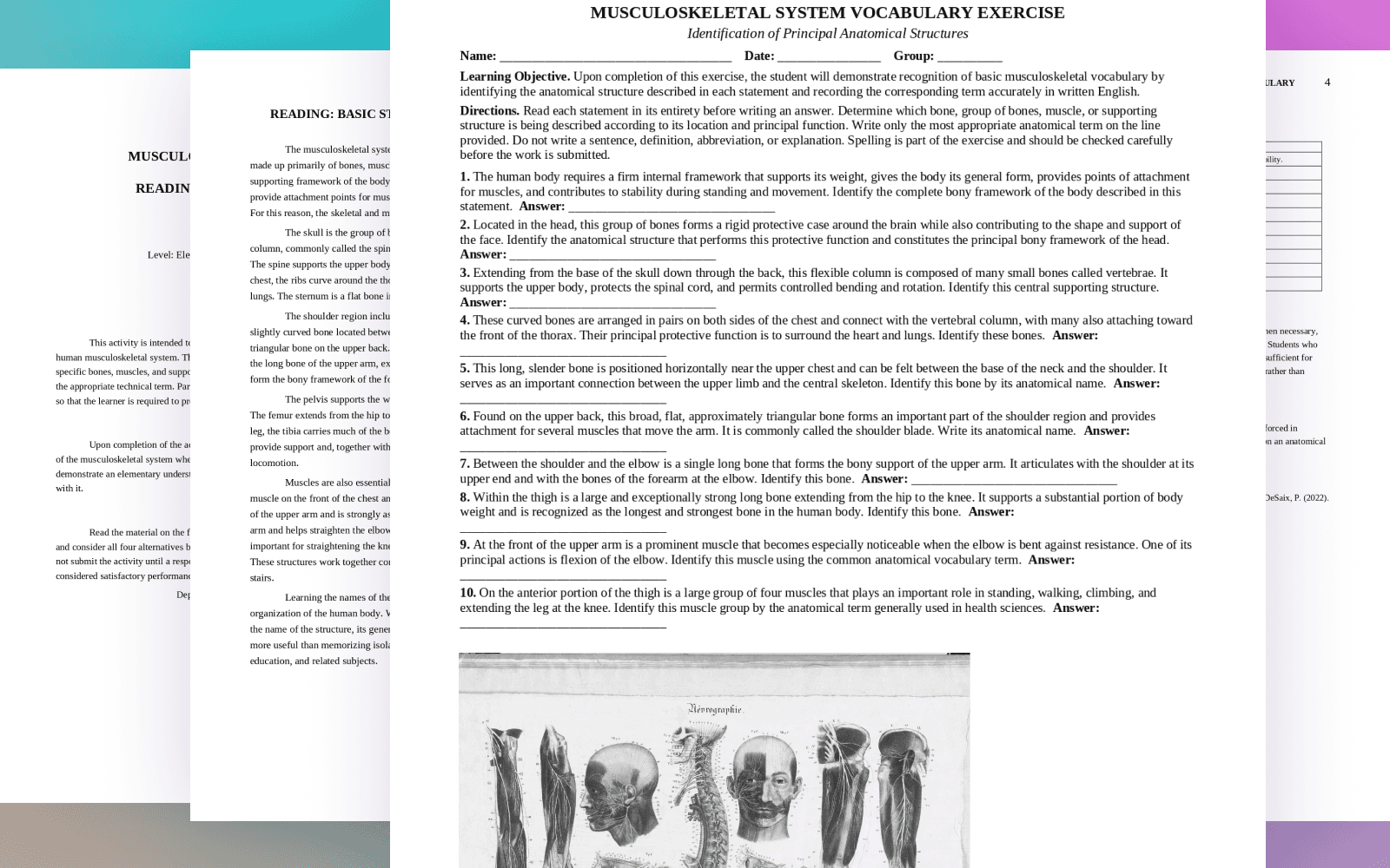
Within that modernization, my scope covered the path between learning content, interaction design and frontend. Activities often started as documents prepared by teachers and instructional designers; the product work was turning them into a usable and consistent experience.
My responsibility included hierarchy, instructions, controls, states, feedback and responsive behavior, as well as implementing much of those decisions in HTML, CSS and JavaScript. Design and development stayed close, so a solution could be adjusted while it was being built and again after release.
Workflow
understand the activity
define interaction
test or prototype
implement
release
review data and comments
adjust
Team
Technical exploration
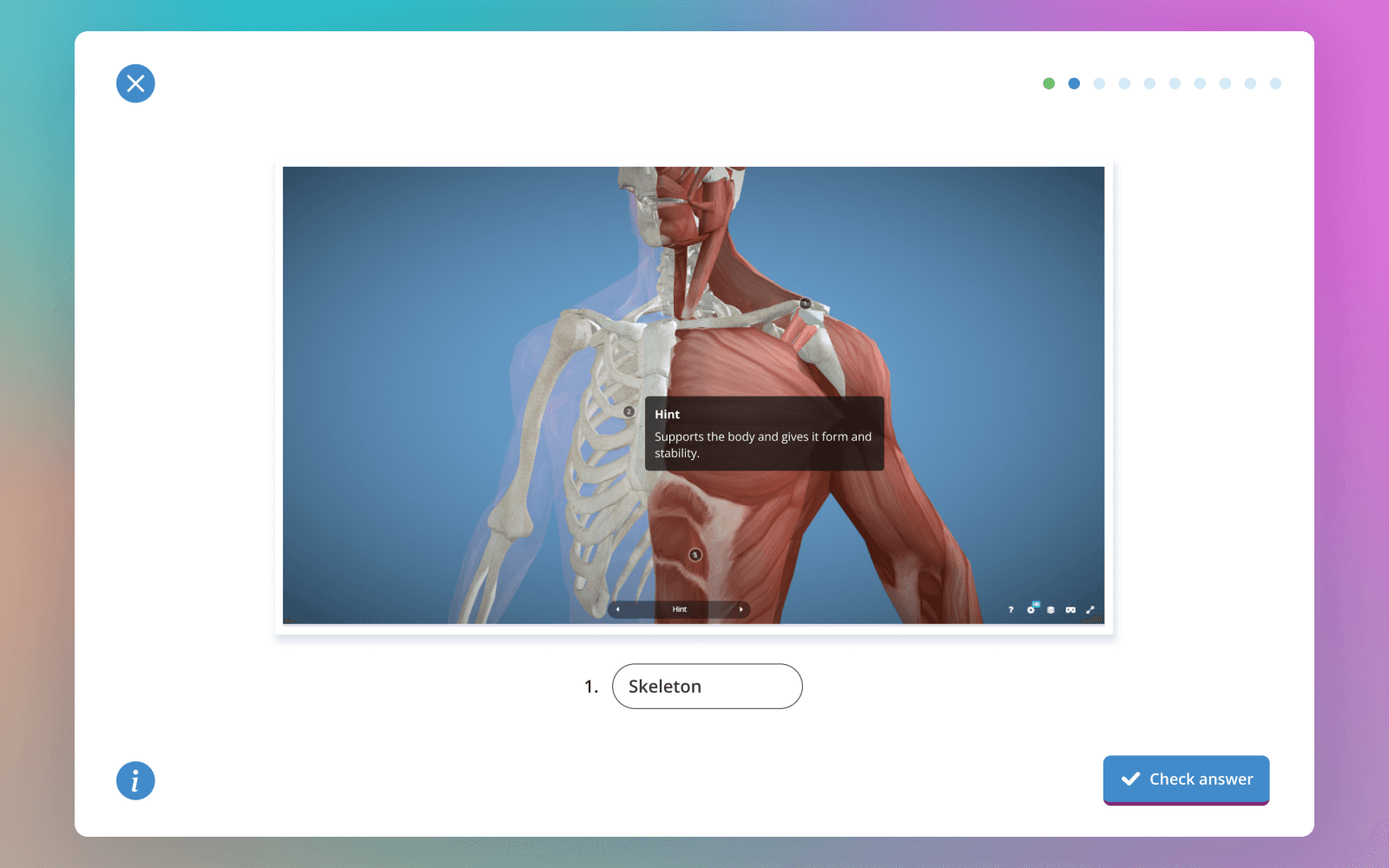
For integrations such as Sketchfab, I first tested what the API allowed. Once the interaction worked, I documented the pattern in Figma so it could be reused later.
30+ interaction patterns
Using those criteria, I designed and reused patterns for different learning goals. Some activities were simple; others combined reading, audio, video or 3D models.
One reading activity placed the text and ten questions in a single view. The problem was not the academic content itself, but how much the student had to process at once.
Full reading and ten visible questions in one view.
Keep the reading available and show one question per step.
Finding
Hypothesis
If we reduced simultaneous information without hiding the supporting text, students could focus on one question without losing the reading context.
Decision
Keep the reading available and show one question per step.
Outcome
The new variant received better feedback and showed higher completion than denser versions.
With more than 30 interaction types, solving every screen from scratch stopped being practical. I built components and rules in Figma based on what was already working in production.
Design → Code
Figma → component → frontend → review
Code → Design
code test → adjustment → working pattern → Figma documentation
Mobile stopped being treated as a reduced desktop version. Each activity was reviewed based on available space and the type of interaction.
Reorder content when needed.
Keep controls and states easy to find.
Avoid interactions that depend on hover.
Review activities across browsers and screen sizes.
Professional English applied the same system to content across six academic areas. The interaction had to fit the vocabulary and situation being practiced.
Professional English areas
3D interaction
For some Health Sciences activities I worked with models prepared in Blender and 3ds Max and integrated through Sketchfab. I added hotspots, questions, hints and feedback around the model.
The platform also included views for groups, grades, progress and academic follow-up. Here the challenge was organizing more information without making it slow to scan.
There was not always time for formal testing before development. We often validated internally, released, and then reviewed real behavior to decide the next adjustment.
Google Analytics
devices · browsers · traffic · usage
Internal data
progress · completion · grades · performance
Support
errors · compatibility · navigation
Comments
students · teachers · academic team
The change showed up in two places: compatibility reports stopped being recurrent and Analytics showed a larger share of mobile use during the responsive transition.
Approximate growth observed in Analytics during the responsive transition.
Different activities built on shared rules.
English content applied to different academic fields.
Support
Blank screens, unsupported browsers and activities that would not open on mobile used to be common support issues. As more content moved to the web and responsive behavior improved, those reports stopped being recurrent.
Product adoption
mironline started as a companion to the books, but later took a larger role in demos and conferences. Interactive experiences and Professional English helped present the product to other institutions.
Seeing mironline in demos and conferences changed the perspective: outside the team, an interaction had to make sense without extra explanation.
Working across learning content, design, frontend and support left me with a simple rule: publishing did not close the design process. Real product behavior informed the next adjustment.
If someone had to contact support just to keep learning, there was still something we could design better.
END OF CASE
This project was where design and implementation started to become parts of the same process for me.
GUIGOLO
Design with intention. Systems with clarity. Experiences you can feel.
MODULE · FOOTER SIGNAL
Tip: if you unlocked something, open “Missions” and flex a little.
Navigation
© 2026 GUIGOLO · MODULE · FOOTER SIGNAL